
Whitelabel the dashboard
The board is styled entirely from CSS custom properties, and uiConfig.theme overrides them per
colour scheme. You do not fork the UI or ship a stylesheet over the top of it. The tokens you set
are written into the page at boot.
Token names follow the shadcn theme contract, so a palette from any shadcn-compatible theme editor drops straight in.
Start with one token
primary is the token the rest of the interactive palette hangs off. The focus ring, the sidebar's
active entry, the selected status tab, the selected page in the pagination, and the hover and
selection washes all resolve to it.
That is the whole change behind both of these:
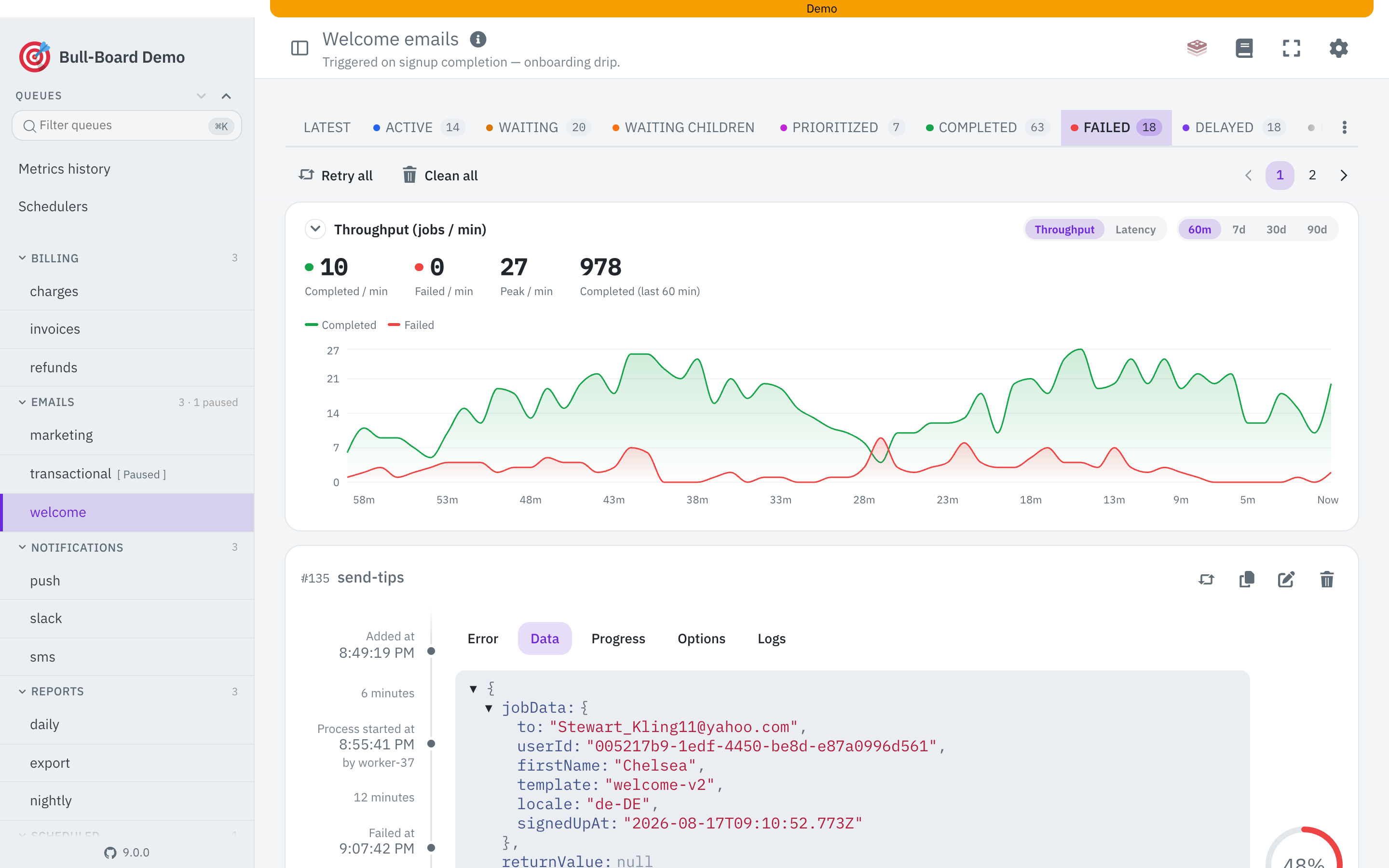
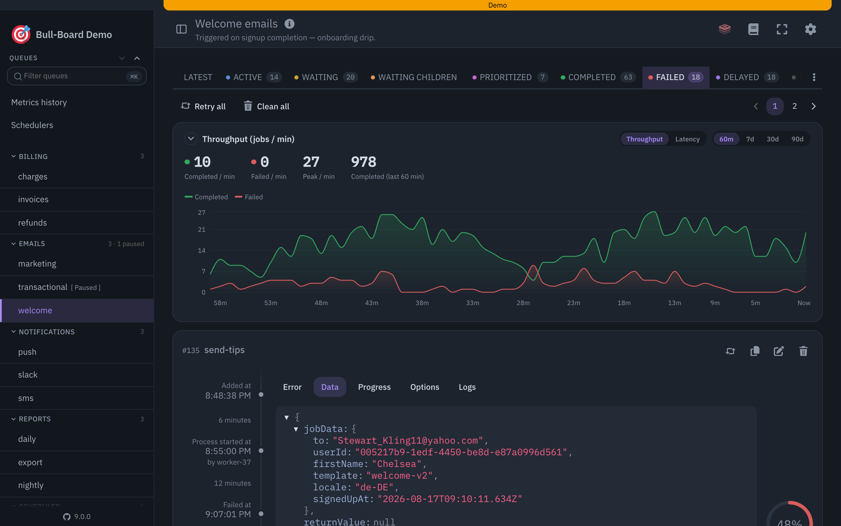
The job status colours stay where they were. Red still means failed, whatever your brand colour is.
radius moved every corner on the board at once, which is usually what you want and occasionally a
surprise.
Set light and dark separately
theme.light and theme.dark are independent maps, and you almost always want both. A brand colour
picked against white tends to fail contrast against the dark surface, which is why the example above
lightens the violet for dark mode instead of reusing it.
Anything you leave out keeps the shipped value, so a theme can be two lines or fifty.
The tokens
A few of those are worth a sentence. The interaction states are mixed from primary at 8%, 16% and
24%, so set them only if you want a hovered or selected control somewhere other than three strengths
of your brand colour. shadow-popover is the one recipe every floating surface uses, and setting it
to none gives you a flat board with borders only. The sidebar has its own namespace because a dark
rail against a light board is a thing people want. And the board puts tabular figures on everything
numeric, so a monospace with proportional digits will look wrong in the counts.
Deriving, and overriding a derivation
Most of that list is derived rather than set independently. ring, sidebar-primary and
sidebar-ring are var(--primary). card-foreground and popover-foreground are
var(--foreground). The chart ramp is the status colours. The state washes are color-mix() of
primary.
Every derived name is still individually overridable, and an override wins, because uiConfig.theme
writes into :root and body.dark-mode and both outrank the derivation. Set ring when you want a
focus ring that is not your brand colour, and leave it out when you don't.
The rest of the chrome
Theming is the palette. The other whitelabel knobs are separate uiConfig keys:

See UIConfig for the full reference.
What a theme cannot do
Values are plain CSS values, and they are sanitised on the way in. Unknown token names are dropped,
and any value containing ;, {, }, < or > is rejected, so a theme cannot inject rules or
markup into the page. If a token you set has no effect, check the spelling against the table above.
A name that is not in the contract is discarded rather than passed through, silently.